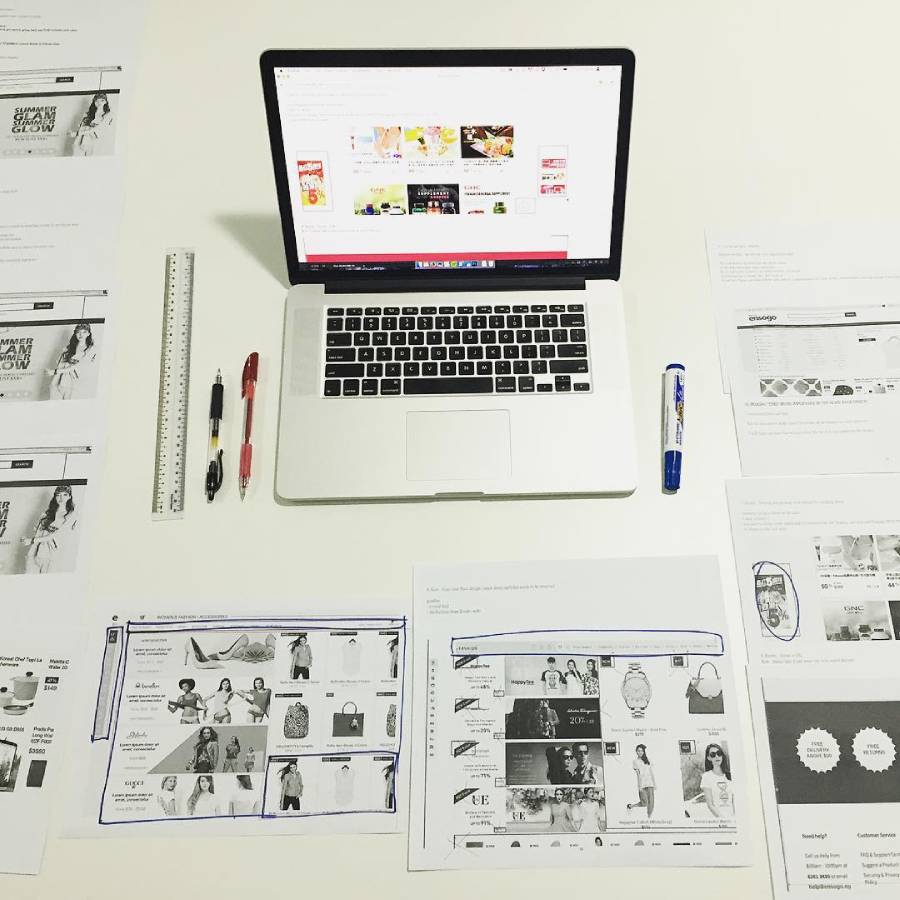
- Show Top Selling Products On Your Home Page
- Offer multiple shipping options
- Minimal fields on checkout information as possible
- Zip code field auto populates city and state
- Provide trustworthy element on website
- Remove Captcha verification
- Call to action button colors is red
- Keep copy clean, tight and to the point
- Prominent shopping cart
- No forms on mobile website
- Offer guest checkout
- Use top conversion colors for targeted demographic
- Mobile responsive web design
- Auto populate shipping information
- Market to customers according to interest and past purchasing
- Call to Action text color different than other text on website
- Eye catching, stand out colors to bring attention to promotions
- Return policy on products prominently displayed on website
- Offer varying frequency of promotion emails
- High resolution, clean images on website
- A/B test placement of call to action buttons
- No other content should be displayed on checkout page of website
- Flat or free shipping policy
- Shopping Security Seal
- Search field for products
- Produce blog content that educates and doesn’t sell
- Giveaways
- High quality product instructional video
- Headlines using powerful action verbs
- Be direct and honest in content development
- Shopping Cart abandonment recovery implementation
- Remove sidebar ads (FYI, this will also help google ranking)
- Redesign website every 6 months to take into account change in user behavior
- Weekly email promotions
- Be HUMAN in brand development
- Revise website copy on a regular basis
- Offer live support
- Have a clear value proposition on website
- Clearly display prices (no unexpected charges)
- Limit the primary colors on your website to 3 colors
- A/B test colors for website
- Zip code marketing for brick & mortar stores
- Auto-populate type (Visa, AMEX, etc) of credit card based on card number
- Testimonials
- Offer free demo or trial period
- Edit home page content once week to keep it fresh
- Cross sell products, but don’t over cross sell
- Declutter, declutter, declutter…and declutter
- Whitespace around call to action button as it calls attention to it
- When in doubt, remove it from your website.


